One of the problems I faced this past year was deciding which software package to use — for statistical analyses, homework problems, and my thesis research. A handful of professors here use SAS, many use Stata, a few use Matlab, and one uses R (that I know of). After a semester using SAS, and despite having only one professor on the R “team” — I decided to learn R.
Here’s why:
- R is free. While I could get student discounts on SAS or Stata, or use the school computer lab, I like my software to be there for me always. If I want to run a regression at 2:00 am using the wi-fi of a Holiday Inn Express, I should be able to run that awesome regression. I can install R on every computer that I need (home, office, laptop, friends, enemies, etc.). This is helpful because the I like to work in a variety of places, and having all my tools on my person is required. *If I had to boil this list down to the one reason I’m using R right now, it’s because of price. You can’t. beat. free.
- R has really good online documentation; and the community is unparalleled. One of the primary motivations for this blog is to give back to the R community that has helped me learn and appreciate the software. I want to mitigate the fixed-costs of learning R, help others in their quest to tackle data-driven analyses, and spread the good word. The more people who use R, the more people with which I can potentially collaborate.
- I like the command-line interface. You can use the command-line interface in other programs like SAS and Stata. But, when you are starting out — is that really what you use? It wasn’t for me. Why? Because I didn’t know any better — I was just starting out! The command-line interface is perfect for learning by doing. You can immediately see the results from inputting a single line of code. If there are errors, you can fiddle with your code and re-hit [enter]. This is the way I learn things, and surely I’m not alone.
- R is on the cutting edge, and expanding rapidly. If you follow any of the online communities that work with R, you will notice all the new packages being rolled out — almost daily! R is on the forefront of statistical methods, and can be integrated from any number of other languages – be it Python, Java, Fortran, etc.
- The R programming language is intuitive. One of the aspects I liked about R when I first started out is that it just worked. I wrote a function that followed my thought process, and bam! – it worked. Immediately it was improving my productivity, without having to know too much about coding or dig through a manual.
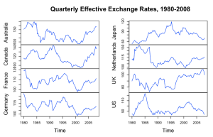
- R creates stunning visuals. See below; some of my favorites. And I’m still a beginner. Using Hadley Wickham’s
ggplot2and the stock imaging platform, it is straightforward to generate sharp diagrams.
- R and LaTeX work together — seamlessly. If you use LaTeX, you are in luck. I am writing my thesis in LaTeX, and just recently stumbled upon R’s tikzDevice package. This package outputs images as TikZ code for direct compilation in .tex. For outputting multiple images, using loops, and reducing the file size of my thesis, this has been a huge plus.
- R is used by practitioners in a plethora of academic disciplines. R users come from myriad industries and academic departments, be it sociology, immunology, economics, statistics, paleontology, anthropology, finance, marketing analytics, etc. This cross pollination is healthy for the enterprising student. By seeing familiar concepts used in other disciplines, and through a different lens, it helps solidify your own understanding. Furthermore, this expanded user base increases the likelihood that something useful to you will be added to the next CRAN package or version of R.
- R makes you think. Some statistical packages make it easy to perform many useful tasks via canned functions. For economists, Stata is one of those such programs. However, being forced to code a procedure by hand, though more time consuming, helps make it “stick”. And the more you get acquainted with R’s many packages, the more you will stumble upon a canned function that will do exactly what you want. But even if that availability exists, R makes is relatively straightforward to code your own procedure, and then check to make sure the two routes return the same results.
- There’s always more than one way to accomplish something. Similar to the preceding point, I find it extremely helpful to tackle a problem two ways (or more), and make sure my results match. When I find that they don’t, I am forced to really learn what’s going on “under the hood” — and in consequence, expand my knowledge of R and econometrics.
Did I forget anything? — Why do you use R to dominate your data analysis?


